Resources
Many of these links will take you to various brand and ecom sites that Handselecta is not necessarily associated with.
Disclosure: Handselecta can earn commissions from qualifying purchases made at that site through some of these affiliate links.
Designing with Type:
The Essential Guide
to Typography
2006. 5th Edition, James Craig
Available at Amazon (paid link)
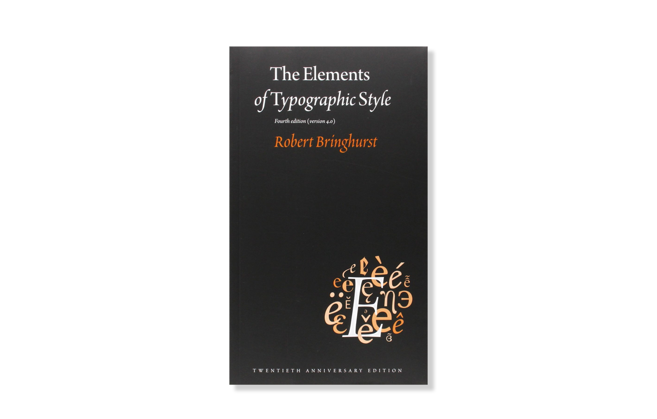
The Elements of Typographic Style
1983. 2013. Robert Bringhurst
Renowned typographer and poet Robert Bringhurst brings clarity to the art of typography with this masterful style guide. Combining the practical, theoretical, and historical, this edition is completely updated, with a thorough revision and updating of the longest chapter, "Prowling the Specimen Books," and many other small but important updates based on things that are continually changing in the field.
Available at Amazon (paid link)
Envisioning Information
1990, Edward Tufte
This book celebrates escapes from the flatlands of both paper and computer screen, showing superb displays of high-dimensional complex data. The most design-oriented of Edward Tufte's books, Envisioning Information shows maps, charts, scientific presentations, diagrams, computer interfaces, statistical graphics and tables, stereo photographs, guidebooks, courtroom exhibits, timetables, use of color, a pop-up, and many other wonderful displays of information. The book provides practical advice about how to explain complex material by visual means, with extraordinary examples to illustrate the fundamental principles of information displays. Topics include escaping flatland, color and information, micro/macro designs, layering and separation, small multiples, and narratives. Winner of 17 awards for design and content. 400 illustrations with exquisite 6- to 12-color printing throughout. Highest quality design and production.
Available at Amazon (paid link)
Understanding Comics
1994, Scott McCloud
"You must read this book." —Neil Gaiman
The bestselling international classic on storytelling and visual communication.
Praised throughout the cartoon industry by such luminaries as Art Spiegelman, Matt Groening, and Will Eisner, Scott McCloud's Understanding Comics is a seminal examination of comics art: its rich history, surprising technical components, and major cultural significance. Explore the secret world between the panels, through the lines, and within the hidden symbols of a powerful but misunderstood art form.
Availane at Amazon (paid link)
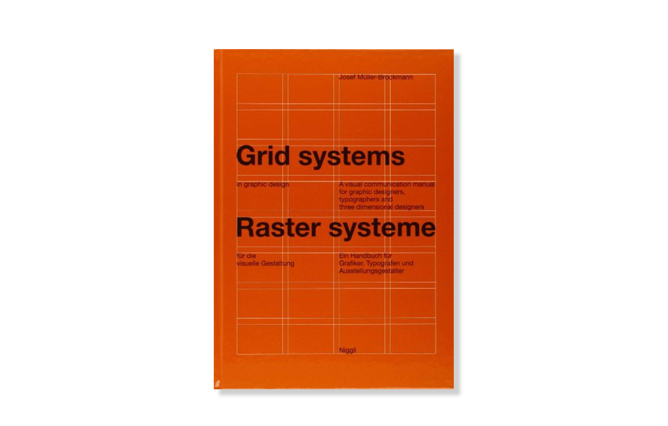
Grid Systems in Graphic Design
1996. Josef Müller-Brockmann
A grid system is a rigid framework that is supposed to help graphic designers in the meaningful, logical and consistent organization of information on a page. It is an established tool that is used by print and web designers to create well-structured, balanced designs. Rudimentary versions of grid systems existed since the medieval times, but a group of Swiss graphic designers, mostly inspired in ideas from typographical literature started building a more rigid and coherent system for page layout. The core of these ideas were first presented by Müller-Brockmann who helped to spread the knowledge about the grids thorough the world. This volume provides guidelines and rules for the function and use for grid systems from 8 to 32 grid fields which can be used for the most varied of projects, the three-dimensional grid being treated as well. Exact directions for using all of the grid systems possibe presented are given to the user, showing examples of working correctly on a conceptual level.
Availane at Amazon (paid link)
Typography: An Encyclopedic Survey of Type Design and Techniques Throughout History
1998, Friedrich Friedl
An Encyclopedic Survey of Type Design and Techniques Throughout History. The most detailed and comprehensive survey and history of typography and alphabets ever undertaken, packed with 2,000 illustrations.
Availane at Amazon (paid link)
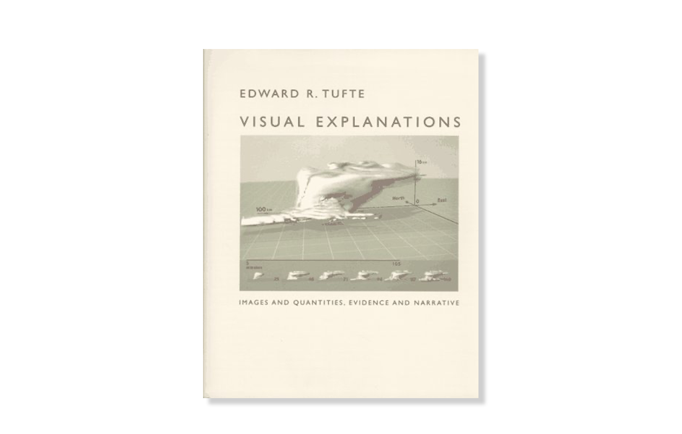
Visual Explanations
1997, Edward Tufte
Describes design strategies - the proper arrangement in space and time of images, words, and numbers - for presenting information about motion, process, mechanism, cause, and effect. Examines the logic of depicting quantitative evidence.
Availane at Amazon (paid link)
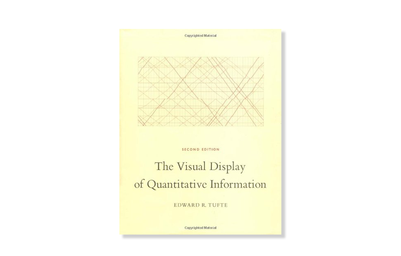
The Visual Display of Quantitative Information
2001, Edward Tufte
The classic book on statistical graphics, charts, tables. Theory and practice in the design of data graphics, 250 illustrations of the best (and a few of the worst) statistical graphics, with detailed analysis of how to display data for precise, effective, quick analysis. Design of the high-resolution displays, small multiples. Editing and improving graphics. The data-ink ratio. Time-series, relational graphics, data maps, multivariate designs. Detection of graphical deception: design variation vs. data variation. Sources of deception. Aesthetics and data graphical displays. This is the second edition of The Visual Display of Quantitative Information. Recently published, this new edition provides excellent color reproductions of the many graphics of William Playfair, adds color to other images, and includes all the changes and corrections accumulated during 17 printings of the first edition.
Availane at Amazon (paid link)
Letters of Credit
1986, 2004. Walter Tracy
The revolution in typesetting - a revolution that over the past two decades has eliminated a five-hundred-year-old system of hot metal production and replaced it with one of photo-generated and computer-driven composition - shows no sign of winding down. This book traces the steps that went into that revolution and simultaneously makes the argument that the letter forms themselves are in process of evolution. Tracy argues that, whether they are of the sixteenth or the twentieth century, the forms that comprise our alphabet are subject to the same rules of good taste, proportion, and clarity that have always obtained. But what we face today is vastly different from fifty years ago. For the first time, new technology has made the proliferation (and, as some would maintain, debasement) of letter forms fast and easy (or quick and dirty.) With fifty years of professional experience on both sides of the Atlantic (including thirty years as head of type design for the British Linotype Company), Tracy is in a unique position to make this argument and arrive at his sad conclusion: the design of distinguished, contemporary typefaces is far outnumbered by the mediocre and downright bad. Part of the reason for this deplorable deterioration is a lack of critical analysis of the particular esthetics involved. This step-by-step examination of type-design esthetics is precisely what Tracy provides here, while avoiding both the promoter's hype and the manufacturer's claims. Here are the gut issues of what makes type good or bad, legible or unreadable. Extensively illustrated with both typefaces and line drawings, this book belongs on the shelf of anyone interested in the history of letters or in the artistry and peculiar problems that lie behind their production.
Availane at Amazon (paid link)
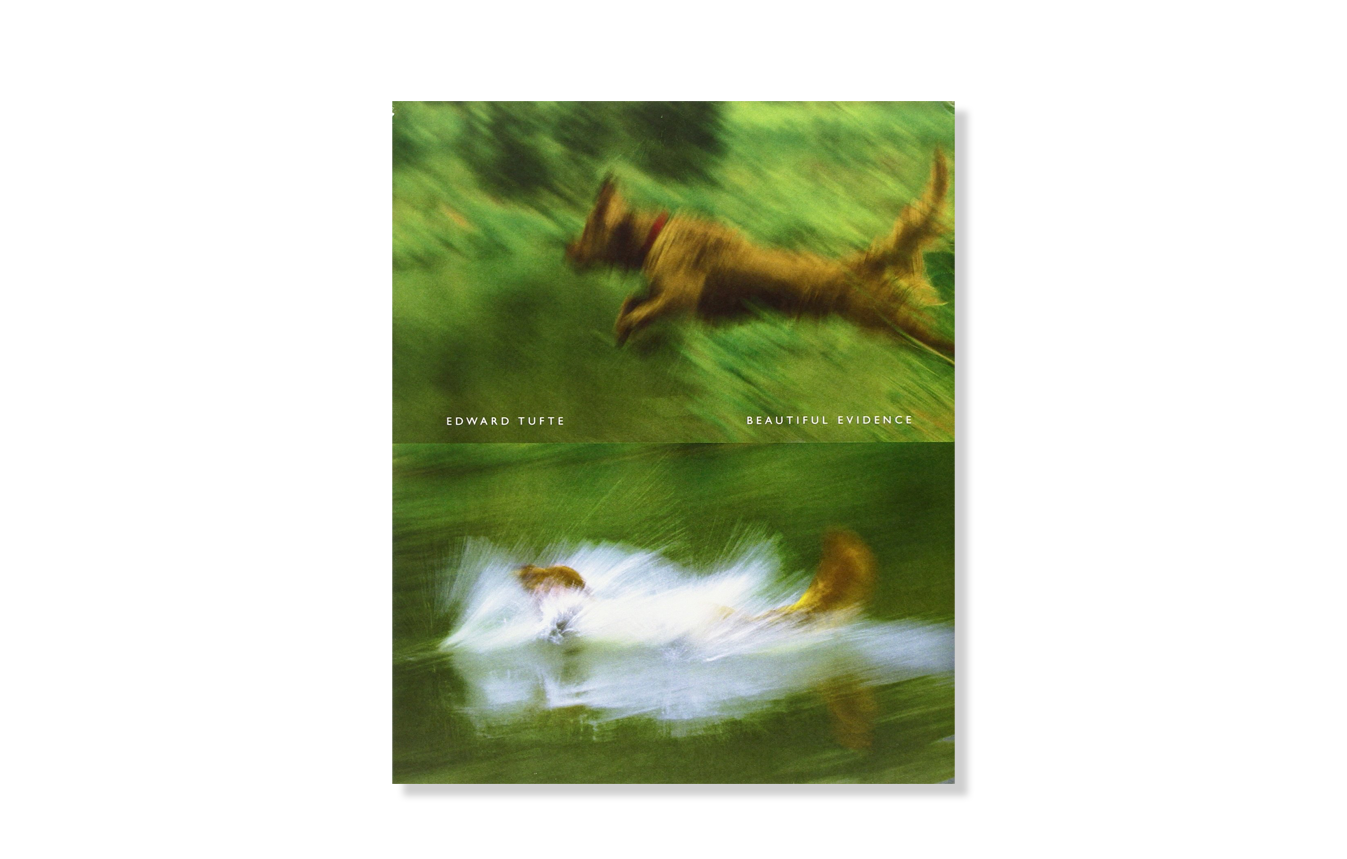
Beautiful Evidence
1997, Edward Tufte
Science and art have in common intense seeing, the wide-eyed observing that generates visual information. Beautiful Evidence is about how seeing turns into showing, how data and evidence turn into explanation. The book identifies excellent and effective methods for showing nearly every kind of information, suggests many new designs (including sparklines), and provides analytical tools for assessing the credibility of evidence presentations (which are seen from both sides: how to produce and how to consume presentations). For alert consumers of presentations, there are chapters on diagnosing evidence corruption and PowerPoint pitches. Beautiful Evidence concludes with 2 chapters that leave the world of pixel and paper flatland representations - and move onto seeing and thinking in space land, the real-land of three-space and time.
Availane at Amazon (paid link)
Emigre No. 70 the Look Back Issue: Selections from Emigre Magazine 1-69. Celebrating 25 Years of Graphic Design
2009, Rudy VandeLans
During the late 1980s and throughout the 1990s, graphic design was experiencing one of its most exciting and transformative periods. The Apple Macintosh computer had been introduced, design schools were exploring French linguistic theory, the vernacular had become a serious source of study and inspiration, the design and manufacture of typefaces was suddenly opened up to everyone who could use a computer, and for the first time in the United States, New York City was no longer the place to look for the latest developments in graphic design. And in Berkeley, California, across the bay from Silicon Valley, Emigre magazine, like no other, recognized the significance of the events, and became both a leading participant and a keen observer of this innovative international design scene, generating a body of work and ideas that still resonate today.
Fueled by Emigre’s successful digital type foundry, the magazine became one of the most popular and controversial graphic design magazines of its time. 69 issues were published in a variety of formats, featuring in-depth interviews with fellow design trailblazers and critical essays by an emerging group of young design writers.
This book, designed and edited by Emigre co-founder and designer Rudy VanderLans, is a selection of reprints, using original digital files,
tracing Emigre s development from its early bitmap design days in the late 1980s through to the experimental layouts that defined the so called Legibility Wars of the late 1990s, to the critical design writing of the early 2000s.
Availane at Amazon (paid link)
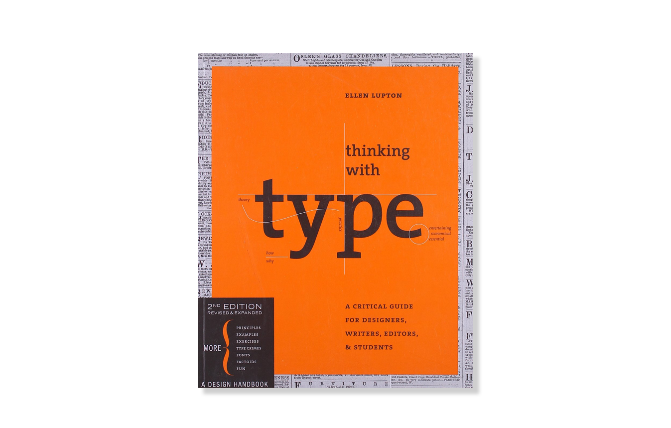
Thinking with type: A Critical Guide for Designers, Writers, Editors, & Students
2010, Ellen Lupton
"Thinking with Type is to typography what Stephen Hawking's A Brief History of Time is to physics."—I Love Typography
Thinking with Type is the definitive guide to using typography in visual communication. Ellen Lupton provides clear and focused guidance on how letters, words, and paragraphs should be aligned, spaced, ordered, and shaped. The book covers all typography essentials, from typefaces and type families, to kerning and tracking, to using a grid. Visual examples show how to be inventive within systems of typographic form, including what the rules are, and how to break them.
Availane at Amazon (paid link)
Massimo Vignelli
From the 2007 documentary Helvetica
Negative Space
“Typography is like music. It’s the space between the notes that really makes the music.”
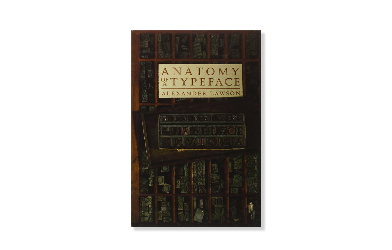
Anatomy of a Typeface
2010. Alexander S. Lawson
An analysis of letter forms, from Garamond and Bembo to the design and manufacture of sans-serif and newspaper type.
Availane at Amazon (paid link)
My Life in Typefaces
2014
Matthew Carter’s TED talk
Pick up a book, magazine or screen, and more than likely you'll come across some typography designed by Matthew Carter. In this charming talk, the man behind typefaces such as Verdana, Georgia and Bell Centennial (designed just for phone books — remember them?), takes us on a spin through a career focused on the very last pixel of each letter of a font. TEDTalks is a daily video podcast of the best talks and performances from the TED Conference, where the world's leading thinkers and doers give the talk of their lives in 18 minutes (or less). Look for talks on Technology, Entertainment and Design -- plus science, business, global issues, the arts and much more.
The Power of Typography
2016
8 min mini documentaryby Cheddar
Imagine how lovely it would be to experience the NYC subway before the MTA unified the system in 1966 with an “unstandardized, unorganized, clutter of signage…”
All respect to Massimo Vignelli, but the filmmaker laments the very features I find so endearing about the chaos and variety of NYC.
But she does a great job of researching and contextualizing the details and eras and shifts.
The Power of Typography
2016
Mia Cinelli TEDxUofM
Ten Principles for Good Design By Dieter Rams
2016
Mia Cinelli TEDxUofM
Times New Roman— Graphic Design History 101
2020
Produced by The Futur
Abstract: Paula Sherr
2020
Netflix Docuseries, Abstract
More Resources
